Creative Agency Rebrand
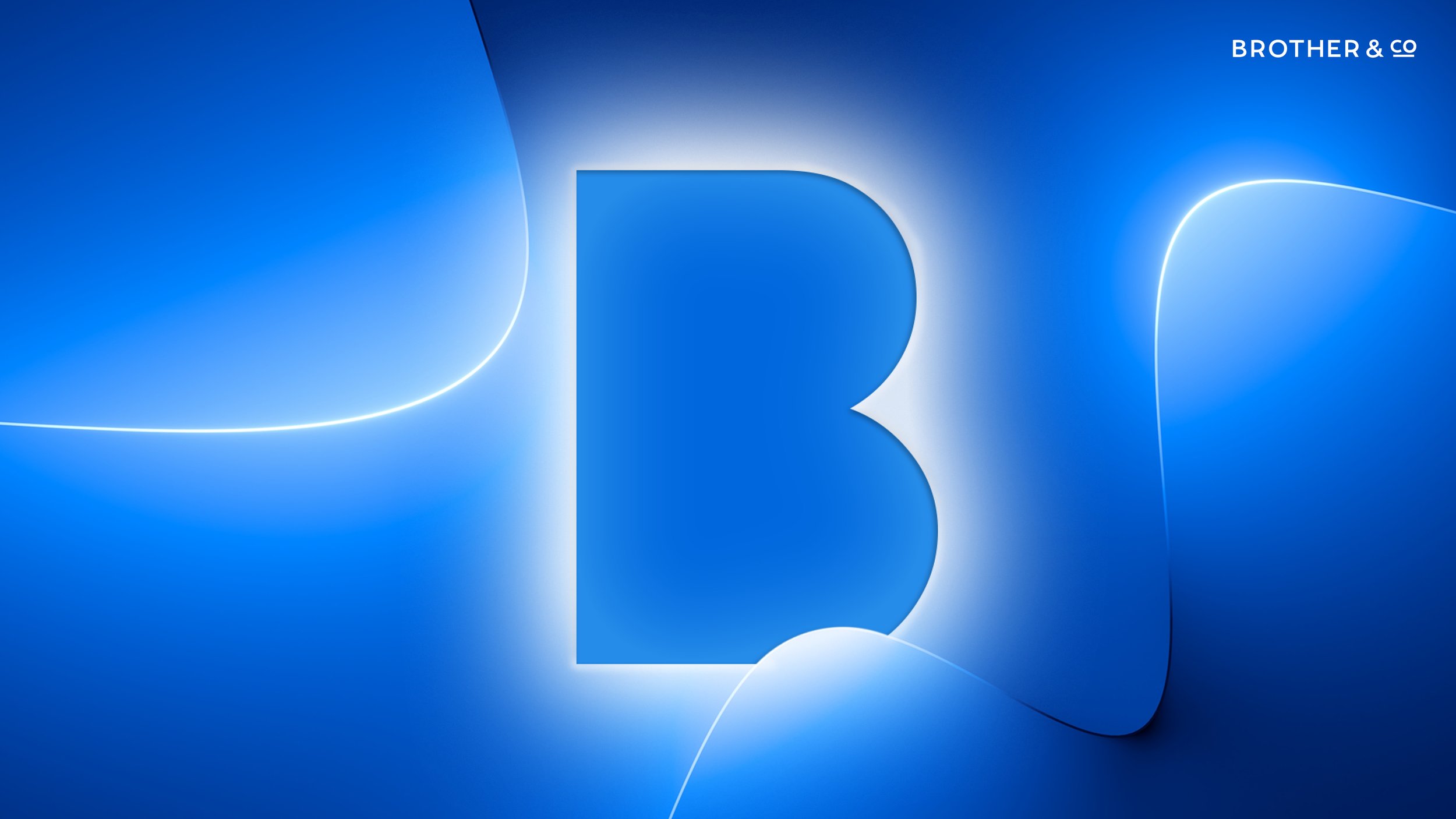
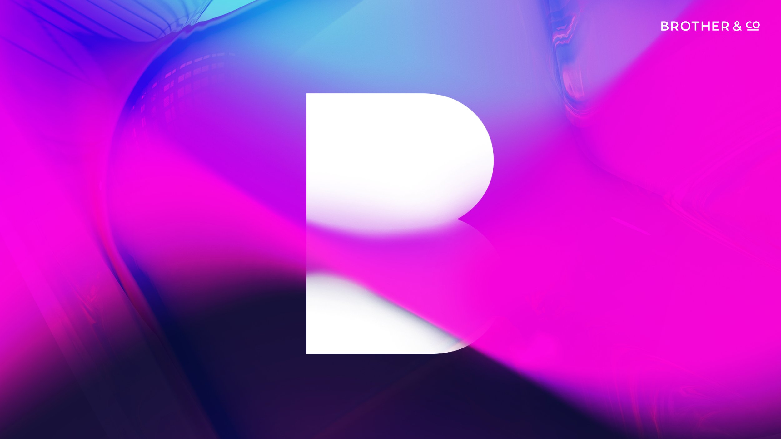
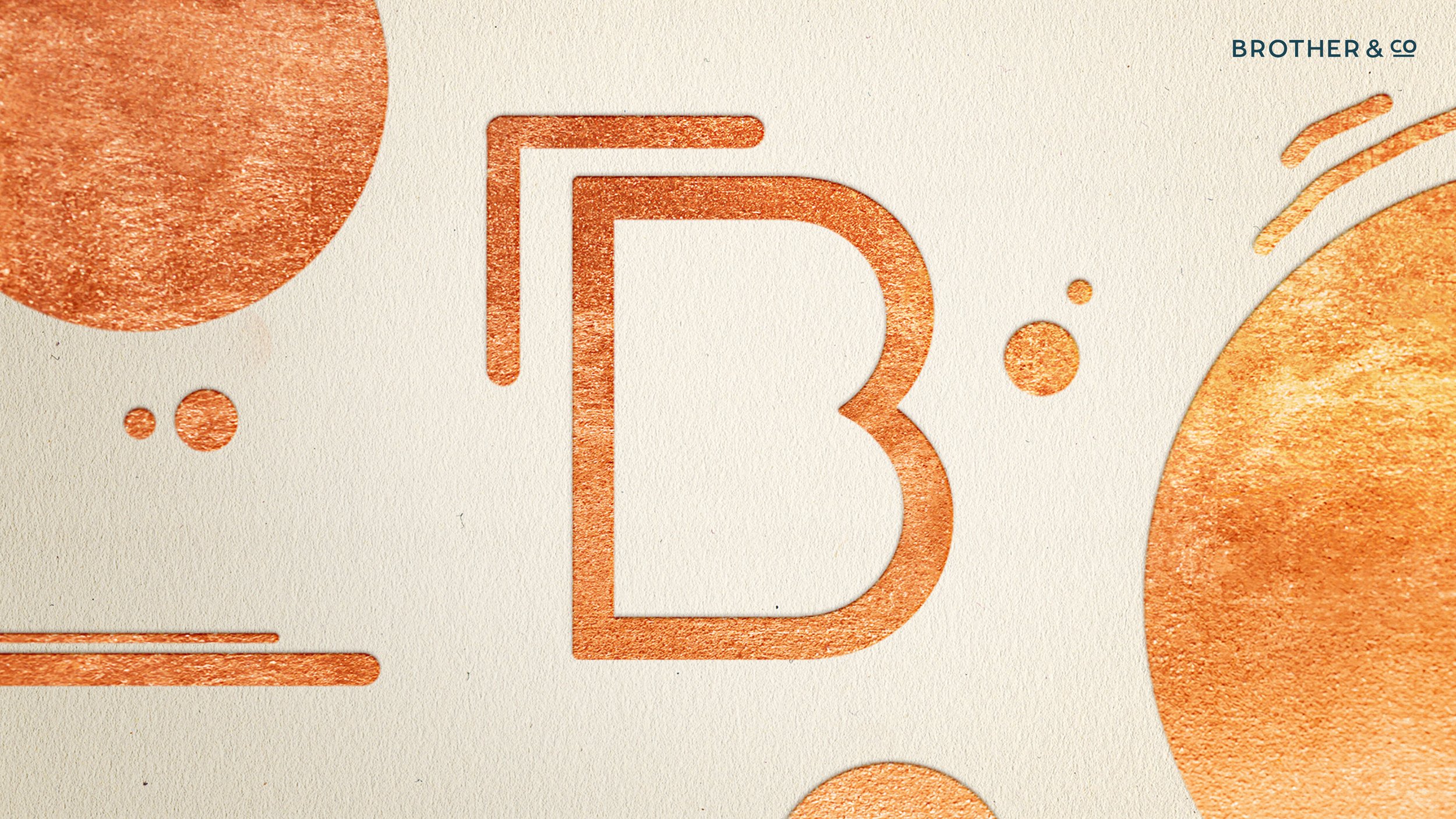
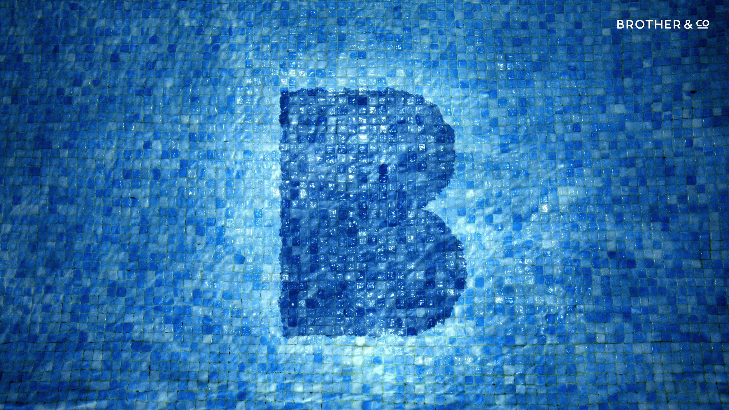
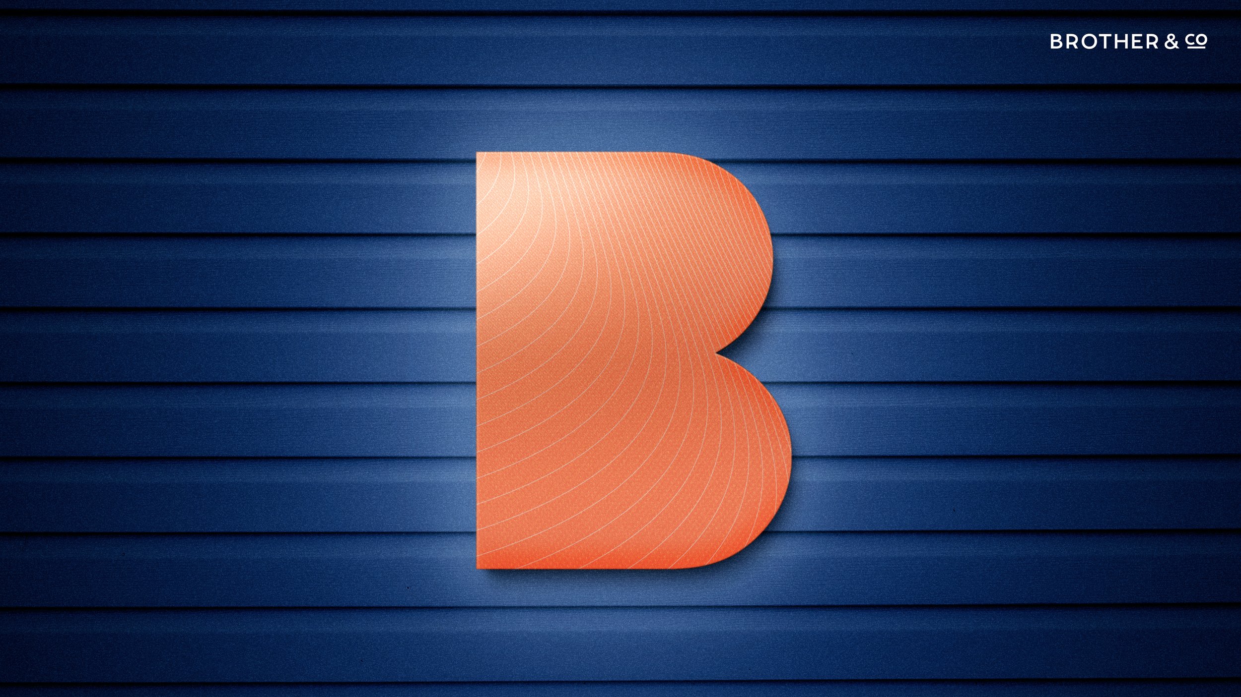
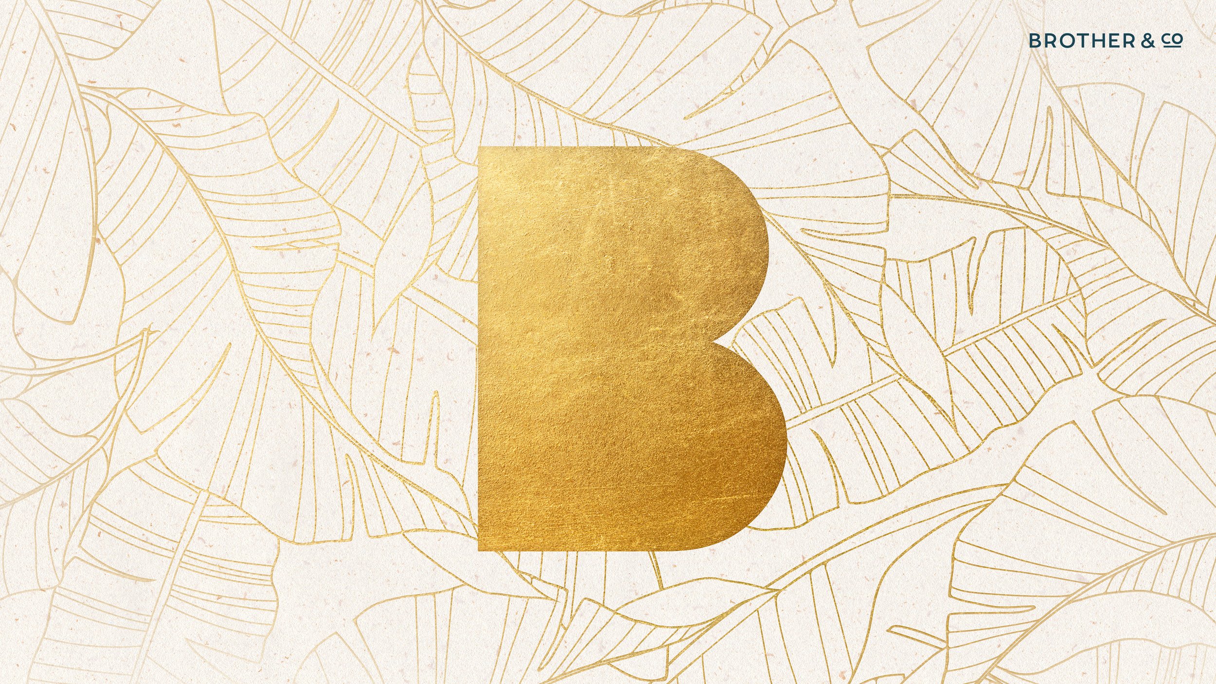
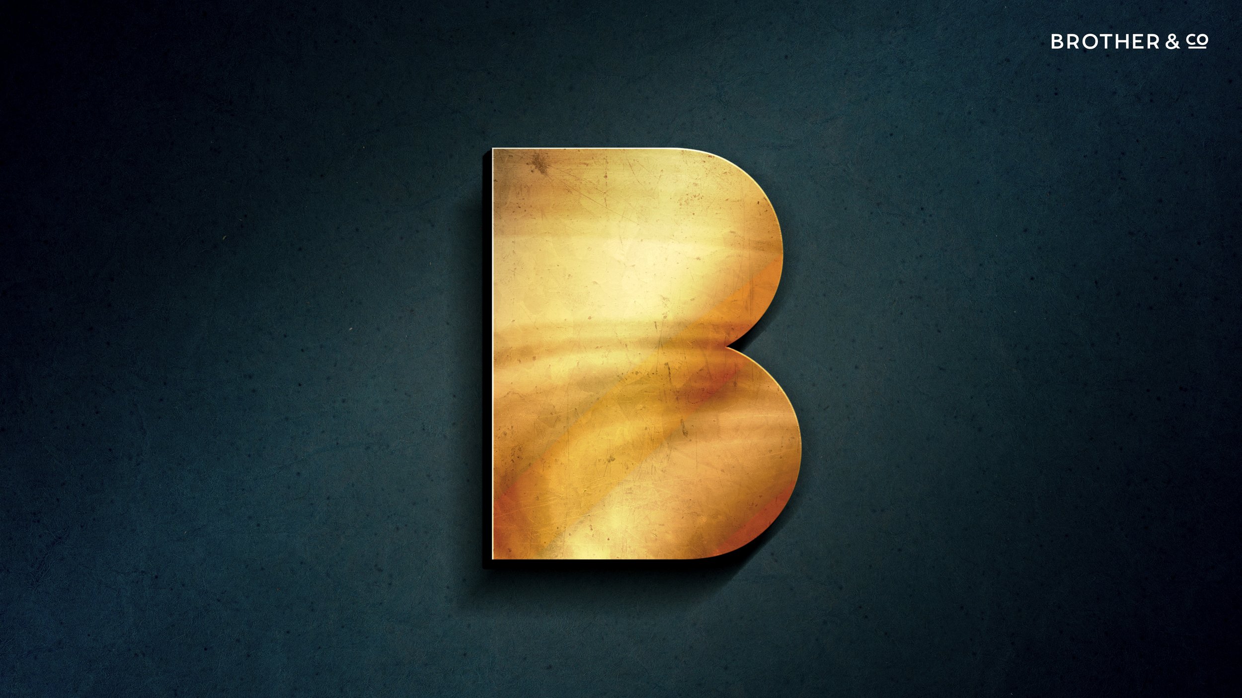
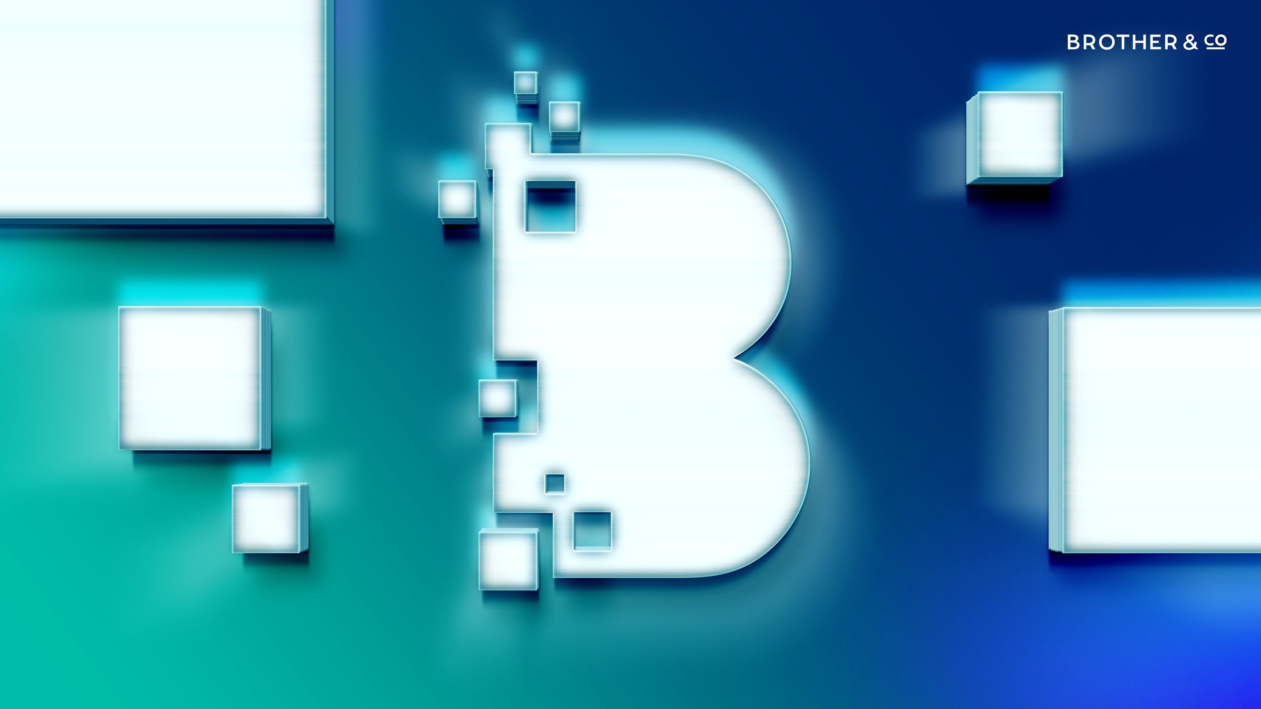
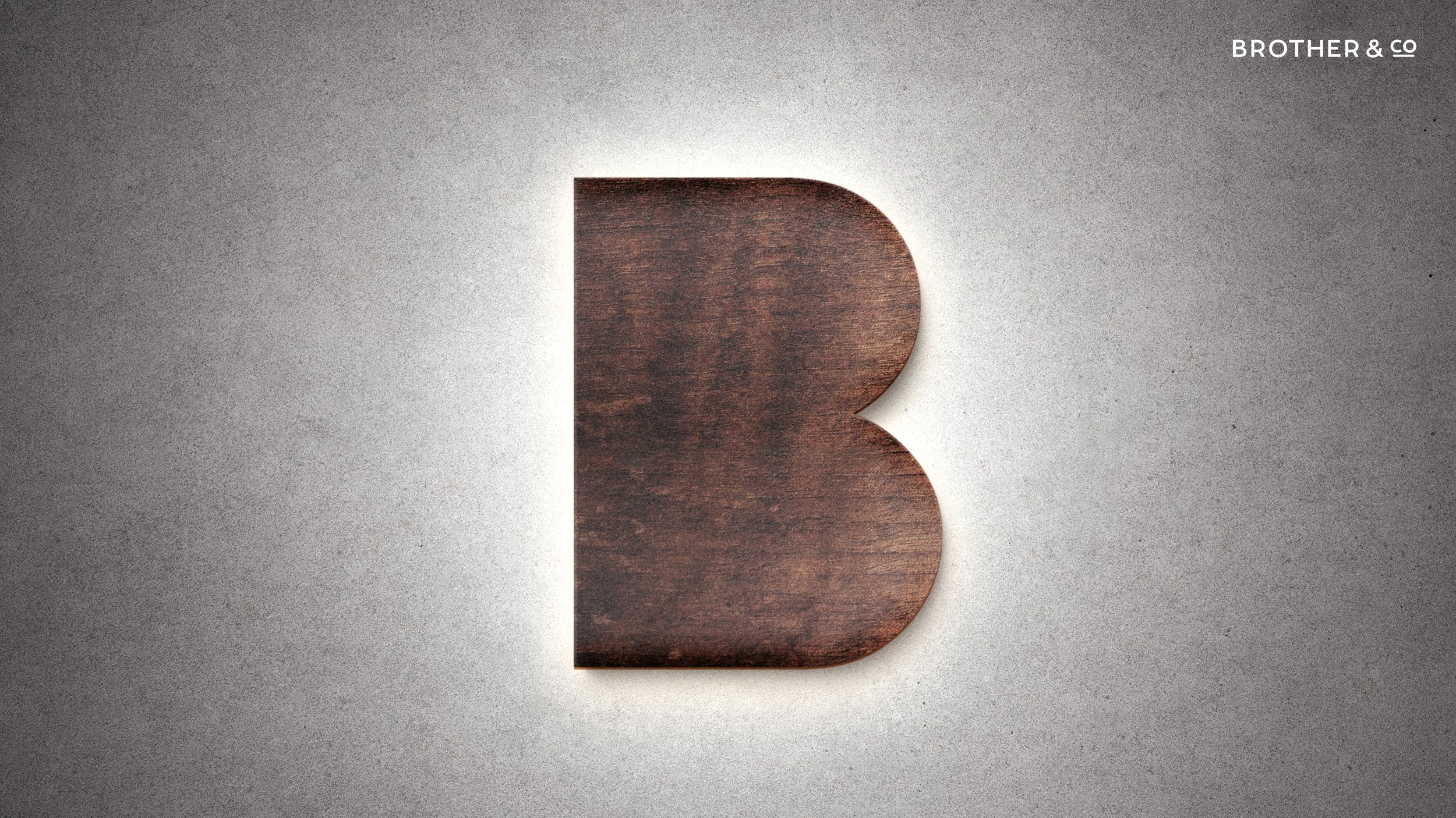
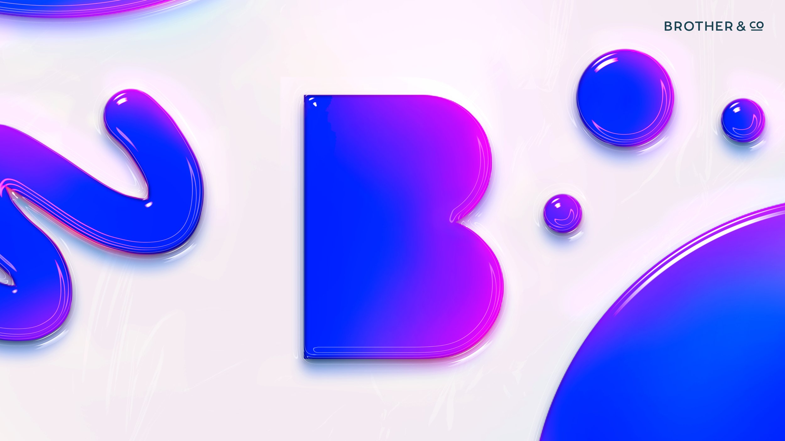
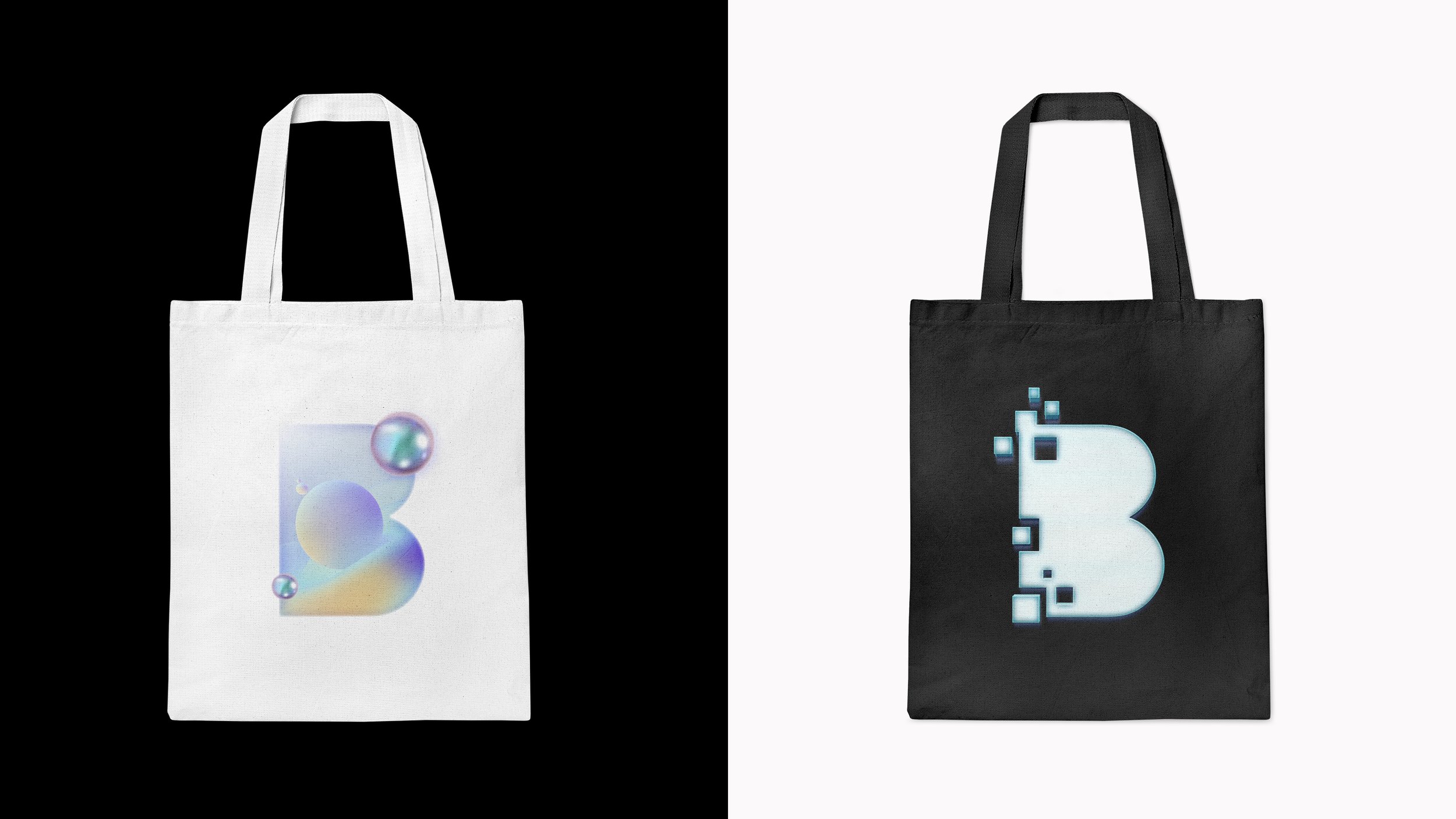
I was asked to take the Brother brand mark and expand their visual system to reflect the phrase “transformational creativity”. To do this I created a dynamic set of B graphics that change in style but not in shape.
The end goal was to re-engage clients using these creative graphics. This project resulted in a custom coded website, fresh visuals for pitch decks and ultimately a cleaner, modern look.
Design / Art Direction / Client: Brother & Co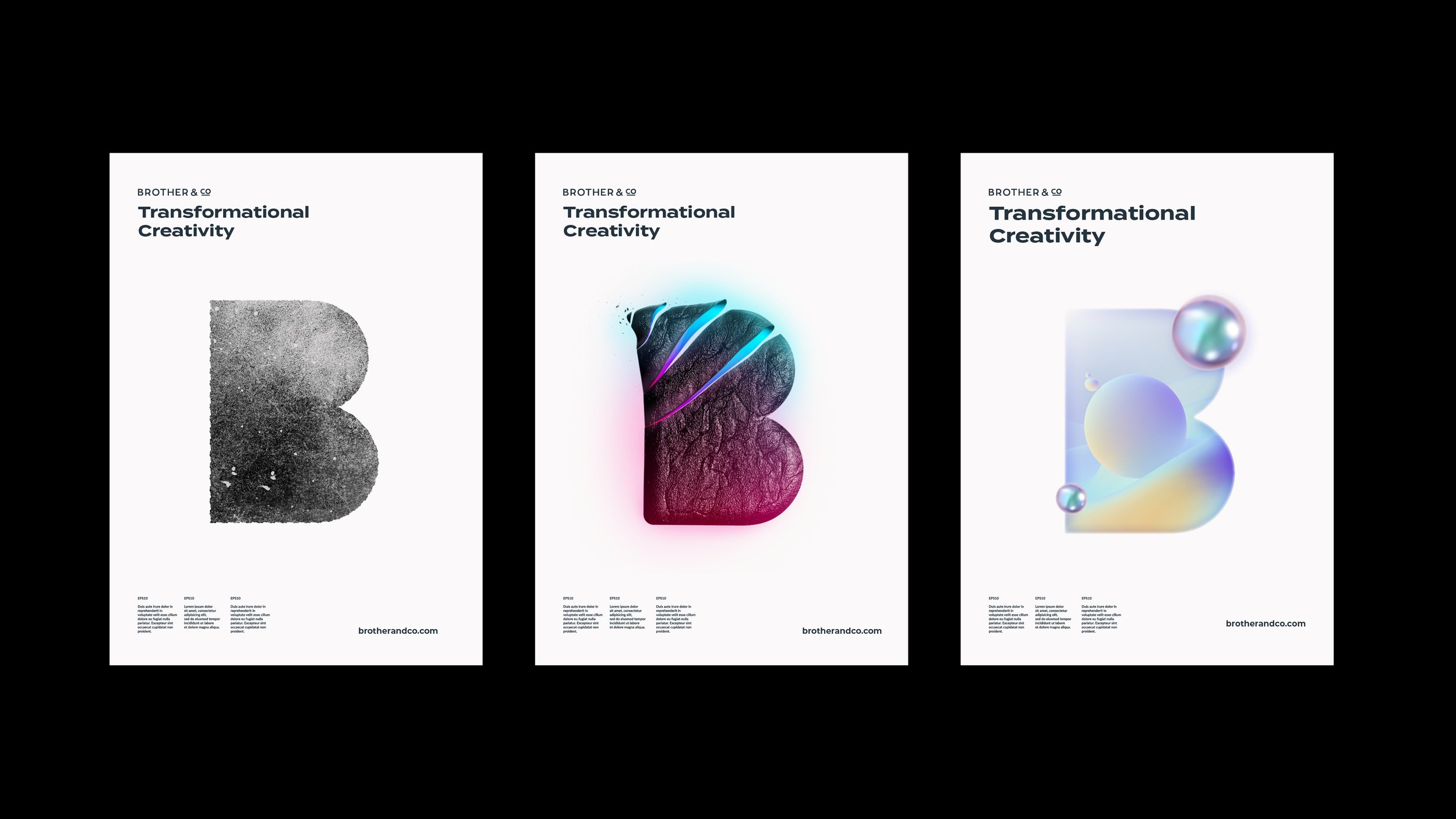
Refining the existing mark
By dissecting the shapes in the original mark I was able to create a visual system that still felt cohesive but could flex in different ways.
Website Redesign
This website redesign is clean and minimal, allowing the agencies work to take the spotlight. The line device (inspired by the logo) has been incorporated in a way that connects all the work back to the Brother&Co mark in the top left corner of the screen.
Transformational Creativity
This dynamic visual system of transforming B’s perfectly embodies the creative agencies motto: Transformational Creativity
